Tigraine

Daniel Hoelbling-Inzko talks about programming

Displaying different screens with ContentPresenters in Silverlight

In WPF you can use a ContentPresenter with DataTemplate to display different Views for different ViewModels. And although writing those DataTemplates gets old pretty quickly (and you resort to frameworks or roll your own code to alleviate that problem), I do like to use them in small demo apps at times.

Silverlight does not support DataTemplates with types on them, so you can’t use ContentPresenters like you would in WPF.

But in this case it helps to understand what a DataTemplate is doing in WPF to easily replicate that behavior in Silverlight. DataTemplates (in this case) are little more than Converters that take objects and supply a template that is then used to display that object to the screen.

Once you know that, it gets rather simple: Simply implement IValueConverter and return a Silverlight UserControl in the Convert method.

You can even write something as simple as this:

public class ViewConverter : IValueConverter
{
    public object Convert(object value, Type targetType, object parameter, CultureInfo culture)
    {
        if (value.GetType() == typeof(NewCustomerViewModel))
        {
            return new NewCustomer();
        }
        if (value.GetType() == typeof(CustomerListViewModel))
        {
            return new MasterDetail();
        }
        return null;
    }

public object ConvertBack(object value, Type targetType, object parameter, CultureInfo culture) { throw new NotImplementedException(); } }

Once your Converter can translate ViewModels (or any object) into Views you can then bind your ContentPresenter to use that Converter:

<ContentPresenter Content="{Binding ActiveScreen, Converter={StaticResource ViewConverter}}" />

You would obviously not want to use the code above, but rather hook your ViewConverter into your Inversion of Control container or something similar (or just use Caliburn.Micro).

There are a number of UI frameworks out there that make writing complex MVVM applications a lot easier. Caliburn, Caliburn.Micro and Prism. I tried some of them and I really liked them, but I found that you should really learn how Silverlight/WPF works before you resort to these Frameworks, as most of their features only start making sense once you start understanding the problems those frameworks set out to solve.

Filed under net, programmierung, wpf

Theming controls in WPF

My biggest grief with WPF is the way how twisted XAML works. It takes a lot of time getting used to it, and it’s by no means obvious how to do stuff.

So this is the story of how to change the appearance of a control from some common resource for controls.

Styles and Setters

Most of the things you’d consider styling (as known from CSS) can be done via Styles that contain setters.

Inside a ResourceDictionary you can define styles for all controls of a type, or have them be applicable by a key. This is pretty similar to CSS where you can apply settings either via class (by key in WPF) or by elementType (TargetType in WPF)

Let’s look at some code:

.highlight {
	color: Red;
} 

translates into the following XAML:

<Style x:Key="highlight"> <Setter Property="Foreground" Value="Red" /> </Style>

Inside a <Style> you can change any property on the target element, in our case the Foreground property that accepts a display brush.

Note that omitting the TargetType property limits you to only properties on FrameworkElement so you might want to define something more specific like TargetType="TextBlock" etc.

If you don’t specify a x:Key the style will be applied to all possible elements matching the TargetType.

Let’s look at CSS and XAML side-by-side:

span { color: Red; }

is roughly the same as:

<Style TargetType="TextBlock"> <Setter Property="Foreground" Value="Red" /> </Style>

Templates

Now we know how CSS (at least in a way) maps to XAML. Things are still pretty different and one of the things that you need to wrap your head around in XAML is templates.

Every control you drag to the surface is usually a collection of borders, shapes and other lower level framework stuff that makes up your control.

So if you want to modify the appearance of your control, you do that via the ControlTemplate. And this is where I am still not 100% sure what the common theme is, but I am getting better at it.

ControlTemplates can be applied either directly to the element, or via a Style inside a Setter.

<Style TargetType="TextBox"> <Setter Property="Template"> <Setter.Value> <ControlTemplate TargetType="TextBox"> <!-- Your Template goes here --> </ControlTemplate> </Setter.Value> </Setter> </Style>

As you can see, all you do inside a <Setter> is pretty much the same as you would apply to the element itself in markup. If you have non-trivial values to set you can use the as you can do with almost all things in XAML.

This is actually an interesting concept that took some getting used to. In XAML you can specify each and any attribute of the element by using the <Element.AttributeName> syntax in case it’s not expressable by a simple literal value.

Now let’s assume I want to change the appearance of a TextBox to have a flat border. If you come from WinForms like me you’ll spend a fair amount of time hunting for a BorderStyle property that’s simply not existant in WPF.

The way to go here is: You guessed it, Control Templates.

The ControlTemplate allows you to replace the visual tree of your object and roll your own that suits your needs (makes it powerful, but rather hard to figure out). My naive approach to this was to simply define the border in WPF like this:

<ControlTemplate TargetType="{x:Type TextBoxBase}">
<Border Name="Border"
	BorderThickness="1"
	Padding="4,2"
	Height="Auto"
	BorderBrush="#FFCCCCCC">
</Border>
</ControlTemplate>

What happened was that I turned my TextBox into a border. No text entering, nothing. I changed the visual tree of the object to only contain a border, and that’s what I got.

It then took me a little while to figure out that you can’t simply change the tree without putting back in an element to write the text to. Apparently for textboxes you have to put in a ScrollViewer named PART_ContentHost.

So the correct way here is:

<ControlTemplate TargetType="{x:Type TextBoxBase}"> <Border Name="Border" BorderThickness="1" Padding="4,2" Height="Auto" BorderBrush="#FFCCCCCC"> <ScrollViewer x:Name="PART_ContentHost" /> </Border> </ControlTemplate>

This then gives us a nice flat border with 1 pixel thickness and a nice shade of gray instead of the gradient brush WPF uses by default.

Triggers

Another very important concept (at least to me) was triggers. Assuming we made our control look pretty, we may want to change it’s appearance once you mouseover it or focus it.

If you try like me using the VisualFocusStyle to do that you’ll soon notice that VisualFocusStyles are not applied when a user clicks the element, only when he navigates to it by keyboard. It was meant to provide UI hints for keyboard navigation, not to indicate focusing in any way.

The correct way to do stuff like OnFocus and OnMouseOver is by using Triggers. With triggers you can do something whenever a property matches a certain value. So in our case we can create a trigger that changes the border color whenever the IsFocused property contains the value True.

I am applying the trigger to my ControlTemplate we defined earlier:

<ControlTemplate.Triggers> <Trigger Property="IsFocused" Value="True"> <Setter TargetName="Border" Property="BorderBrush" Value="#FF00A9DA" /> </Trigger> </ControlTemplate.Triggers>

This trigger now only works with one Property/Value, IsFocused. But there is a way to verify that two conditions are met before the trigger fires using the MultiTrigger.

The concept is the same:

<MultiTrigger> <MultiTrigger.Conditions> <Condition Property="IsMouseOver" Value="True"></Condition> <Condition Property="IsFocused" Value="False" /> </MultiTrigger.Conditions> <Setter TargetName="Border" Property="BorderBrush" Value="Black" /> </MultiTrigger>

This MultiTrigger will only apply the black BorderBrush if IsFocused is false and IsMouseOver is true. Thus making sure the IsFocus style is not overridden and flickering whenever the user waves the mouse around.

DataTriggers

Triggers are only good for one thing: Firing if properties on the Visual Tree change. If you want to do something when something in your DataContext changes you need DataTriggers. These work by defining a Binding and a Value, but in essence work pretty much like normal Triggers, only that they work on anything you can bind to.

DataTriggers also come along in MultiDataTrigger and DataTrigger flavors.

DataTriggers are also the answer to most questions concerning MVVM asking “How can I show X from my ViewModel.”. The answer here is usually: "Define some boolean property (with INotifyPropertyChanged) and set up a DataTrigger to it. (This works for starting animations etc.. Everything.. This is crazy powerful!)

And that’s about all the stuff I spent most of my morning figuring out. I hope you get any useful information out of it. Because I quickly became frustrated with the content that’s out there.
Filed under net, programmierung, wpf

How to use different layout containers in WPF

WPF is different, that much I knew before I started learning it. But understanding really how different it is really takes a lot of time and effort. Especially when used to Windows Forms and HTML+CSS, WPF feels very alien in it’s way how to do layout. Here is what I learned:

StackPanel:

StackPanels are used to layout elements horizontally stacked onto each other.

image

By default the elements inside a StackPanel will take up their set height and you can make them fill the whole width by setting their VerticalAlignment to Stretch

They will however never fill the full height of the container when it is resized, no matter how your HorizontalAlign property is set. If the above container got resized in height the buttons would still stick to the top with their individual heights staying just the same.

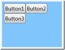
WrapPanel:

They are the same as the StackPanel, just in vertical. They stack elements vertically and reorder them if there is no more space vertically. However they also don’t allow them to fill the vertical space available to the control.

image

The Dockpanel:

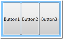
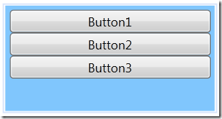
Where both WrapPanel and StackPanel don’t allow Elements to fill vertical space (even with HorizontalAlignment to Stretch) the DockPanel will do just that by default:

image

The trick here is that only the last child really fills the panel, so while resizing the height will resize all 3 buttons, a horizontal resize will only cause the third button to change size. This has to do with the LastChildFill property, where Button3 is considered the filling element.

Why am I telling you this? Well, turns out most UIs look something like this:

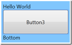
Some header, then one filling list that should resize and then some controls around the edges. Making the list resize with the parent container can’t be achieved by the other panels at all. You have to use a DockPanel and use the DockPanel.Dock attributes on your child controls:

<DockPanel Margin="0,0,0,0">
	<TextBlock DockPanel.Dock="Top" Text="Hello World" />
	<TextBlock DockPanel.Dock="Bottom" Text="Bottom" />
	<Button Content="Button3"></Button>
</DockPanel>

This will make the last element fill all available space left by the elements that where docked to the sides like this:

image

Once you understand these three layout concepts, you can build pretty much everything by nesting panels within each other. There is however also the GridPanel that lends itself very well to creating forms and other stuff that has to be aligned on a grid. But I won’t go into that in this post (and I think it’s markup is just awful. HTML4 tables were more intuitive to write)

Filed under net, programmierung, wpf

Beware of &lt;Button IsDefault=&rdquo;True&rdquo;&gt; in WPF/Silverlight

I’ve spent the better part of my weekend finding this bug and thought I’d share it in case someone else is having the problem. I’m building a WPF user interface with a NServiceBus backend and started noticing that sometimes changing data on the client didn’t generate UPDATE statements in my Database. I first assumed it had to do with my backend code, then I started digging through the various libraries I am using (NHibernate and NServiceBus) to find the problem.

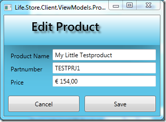
After 2 days debugging through the backend code I finally found out that it’s the WPF application that sometimes sent wrong data. The scenario is quite simple:

image

This very simple dialog uses a StringFormat to display the Price field. This prevents me from using any other binding than a UpdateSourceTrigger=”OnLostFocus” because otherwise it would reformat the field on every key-press. Rendering it unusable due to a jumping focus caret. 

The issue was that upon hitting Save, sometimes the Save method was executed before the data was bound to the model, sometimes the other way around. I genuinely thought I had a race condition until I noticed one little thing: Since it’s a decimal field I usually fill those in by using the number pad. That also led to me hitting the Enter quite often without thinking about it, thus invoking the Save method while still having the focus on the Price Textbox.

If you set a Button to IsDefault=”True” and hit Enter the Command will be executed without triggering the OnLostFocus Databindings in your Textbox, making your code act on stale model data. The only way around this is to either use UpdateSourceTrigger=”OnPropertyChanged” (not always applicable) or remove the IsDefault attribute from your form.

I still believe this is a bug in WPF, but at least now I know about it and can avoid it.

Filed under net, programmierung, wpf

WPF FormatString and it&rsquo;s localization bugs

As some of you may know, I am from Austria. That means that I get to pay my bills in Euro and we format our decimals with a comma instead of a period (yes I know I’m weird).

So naturally my culture setting is de-AT and I really expect to see my decimals formatted this way: € 19,99
Turns out, WPF doesn’t give a damn and if you use FormatString in a binding it will just go ahead and return en-US formats!

<TextBox Text="{Binding Path=Model.Price, StringFormat=\{0:c\}}"/>

This is a bug in WPF and has been there for more than 2 years now from what I can gather. There is a fix to it as suggested by Nir Dobovizki, who coincidentally also has a pretty cool CheatSheet on WPF Databinding that I now have taped to the wall.

For the sake of completeness here is the code you have to put in your App startup code (I’ve thrown it in my App constructor):

FrameworkElement.LanguageProperty.OverrideMetadata(
    typeof(FrameworkElement), 
    new FrameworkPropertyMetadata(
        XmlLanguage.GetLanguage(CultureInfo.CurrentCulture.IetfLanguageTag)));

While at it I also found out another pretty cool thing that managed to save me a lot of markup in XAML: MultiBinding! You can apply StringFormat to single elements through the {Binding} blocks, but sometimes you want to show stuff like “Showing Page x of y” somewhere.
My naïve approach was to just create 4 elements and bind 2 of them to the appropriate values. As Brian points out in his post on WPF StringFormat you can just do stuff like this:

<TextBlock VerticalAlignment="Center" Margin="0, 0, 0, 10">
    <TextBlock.Text>
        <MultiBinding StringFormat="Showing Page {0} of {1}">
            <Binding Path="CurrentPage" />
            <Binding Path="NumberOfPages" />
        </MultiBinding>
    </TextBlock.Text>
</TextBlock>

The StringFormat attribute works exactly like the String.Format method whereas the <Binding> children are the parameters passed into it. Pretty cool to say the least.

Now if only someone explained to me why WPF Grids have this hideous way of cluttering up my markup with Grid.Row=”0” Grid.Column=”1” I may finally make my peace with WPF (aka the display technology I stayed away until now because learning it seemed like an impossible task)

Filed under net, programmierung, wpf

Untangling the dependency ball! Windsor + NServiceBus + Caliburn + Fluent Nhibernate in one package

confusing-road-sign-large-web-view

Unfortunately nu is still falling short on one thing: Making sure that all the stuff you install is actually compatible with the other stuff you have already installed. There is a ticket for this and I’m fairly confident this will get resolved (please vote the ticket up), but for now I was back to figuring out what version of what framework to use to make my app compile.

As always, the main problem was Castle.Core, being present in 3 different versions. (NSB used version 1.1, Caliburn 1.2 and the latest Windsor release targets 2.5)

I decided to back down and use 1.2 since there is a NHibernate gem for 1.2 and a Windsor gem for 1.2. I’m now using NHibernate 3.0 alpha so think about using this “stack”.

Anyway, this is a collection of:

  1. NServiceBus 2.0 .NET 4 (2.0.0.1219)
  2. NServiceBus.ObjectBuilder.CastleWindsor
  3. Castle.Windsor (2.1)
  4. Caliburn 2.0 (still unreleased from the trunk)
  5. NHibernate 3.0.0.1002
  6. FluentNhibernate 1.1 (Updated to NHibernate 3.0)
  7. AutoMapper

Disclaimer: The whole thing is built for .NET 4.0 and works on my machine. Don’t blame me if it’s broken for you.

Anyway. You can download the whole package of libraries here: castle-stack.rar

Useful Resharper Live Template for WPF development

While doing some work in WPF for a customer project I found myself writing far too often code like this:

private bool isSelected;

public bool IsSelected {     get { return isSelected; }     set     {         isSelected = value;         OnPropertyChanged("IsSelected");     } }

Auto-properties simply don’t work with INotifyPropertyChanged so you have to do all the grunt work over again .. Thank god there is Resharper!

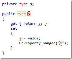
It’s said lazyness is a virtue on a programmer, so I made this little Live Template that will create all that code with you only having to fill in type and name of your property:

image

Download it here: wpfprop.xml

Filed under net, programmierung, wpf

WebKit like focus indicator for WPF Windows

If you like Chrome/Safari or not, one thing that both have and all others lack is a good focus indicator that graphically shows me where my focus currently is. Jeff Atwood wrote something interesting on the topic of Where the Heck is My Focus:

But even if developers do remember to test for basic keyboard behavior, there's a deeper problem here. Keyboard navigation relies heavily on the focus. In order to move from one area to the next, you have to be able to reliably know where you are. Unfortunately, web browsers make it needlessly difficult to tell where the focus is.

I believe he not only has a valid point here, but also that his criticism this should not be limited to web browsers. Most if not all Windows applications do this thing badly, and it’s up to us developers to fix it.

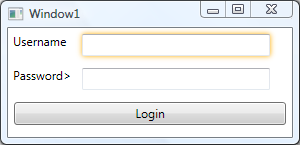
So, I decided to try to put my recent WPF research to good use and tried to implement a small class that applies/removes a WebKit like focus caret:

image

The whole implementation is completely encapsulated inside a class named WebkitFocusEffect that only needs to be initialized during your window construction:

public Window1()
{
    InitializeComponent();

    WebkitFocusEffect.Initialize(this); }

How does it work?

First of all, the source is available on BitBucket in my repository, so you can just go ahead and look at it. But I’ll also try to shed some light about what goes on there.

Routed Events

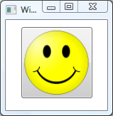
WPF introduced a cool concept called RoutedEvents, meaning that an Event like GotFocus/LostFocus will travel through the object model to the point where it gets handled and stops there. This technique is important because, unlike Windows Forms, WPF controls can contain other UIElements. This gives you far more control over the look and feel of your application, allowing for crazy things like a button with a image instead of text:

<Button Width="100">
    <Image Source="http://upload.wikimedia.org/wikipedia/commons/thumb/8/85/Smiley.svg/100px-Smiley.svg.png"></Image>
</Button>

Resulting in this:

image

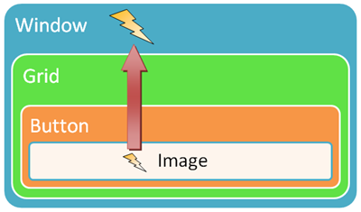
And that leads to the point of RoutedEvents: How do you know that the button was clicked? The event that was fired was the image’s click event, not the button. So, WPF introduced the concept of RoutedEvents that can traverse the object tree upwards and downwards. What means that the image’s ClickEvent gets passed on to it’s direct parent (our friend the button) to get handled there.

 image

If not handled at some level the event would travel up through the whole tree until reaching the root.

I used this technique to hook up the GotFocus/LostFocus events on our window (being the root element), relying on the fact that any GotFocus events by it’s children will bubble upwards the graph eventually reaching the window’s handler.

The handler then just unwraps the event’s source object (the source of the RoutedEvent gets passed along through the RoutedEventArgs parameter) and modifies it’s Effect property:

protected virtual void WindowGotFocus(object sender, RoutedEventArgs e)
{
    try
    {
        if (!(e.Source is UIElement)) return;

        var element = (UIElement) e.Source;         if (element.Effect == null)         {             var effect = new DropShadowEffect {Color = Colors.Gold, ShadowDepth = 0, BlurRadius = 8};             element.Effect = effect;             removeEffect = true;         }     }     catch (Exception ex)     {         Log(ex);     } }

One problem still remained: RoutedEvents can stop bubbling if they get handled at a lower level. This is how the button stops the image’s click event from spreading to it’s parent element, therefore containing it. So if you set an RoutedEventArgs.Handled property to true, it will stop bubbling up the tree:

private void LoginButton_GotFocus(object sender, RoutedEventArgs e)
{
    //This Event was handled and will not call Window's GotHandled eventhandler
    e.Handled = true;
}

Cool though is that RoutedEvents can’t really be stopped from bubbling, they do so anyway. Handled events just don’t invoke any event handlers up the tree any more, and that can be overridden explicitly when subscribing to the event:

window.AddHandler(UIElement.GotFocusEvent, new RoutedEventHandler(WindowGotFocus), true);

The last parameter is “handledEventsToo” and if set to true the event handler will be fired even if the event was already handled at a lower level. Allowing us to still do our thing while not getting in your way when subscribing to GotFocus / LostFocus events.

Effect

One little limitation is there though. Currently there is no EffectGroup container similar to the BitmapEffectGroup, and therefore only one effect can be applied to any UIElement at one time. So WebkitFocusEffect will just skip elements that already have a Effect defined.

I consciously went with the DropShadowEffect and not with the OuterGlowBitmapEffect because Effects are hardware accelerated (means they get processed by your idle graphics card instead of the CPU) and will not slow your application down as BitmapEffects would.

You can download the WebkitFocusEffect.cs through Bitbucket.

Filed under net, programmierung, wpf

My Photography business

Projects

dynamic css for .NET

Archives

more